
VicRoads: a digital licence for 7.2 million Victorians
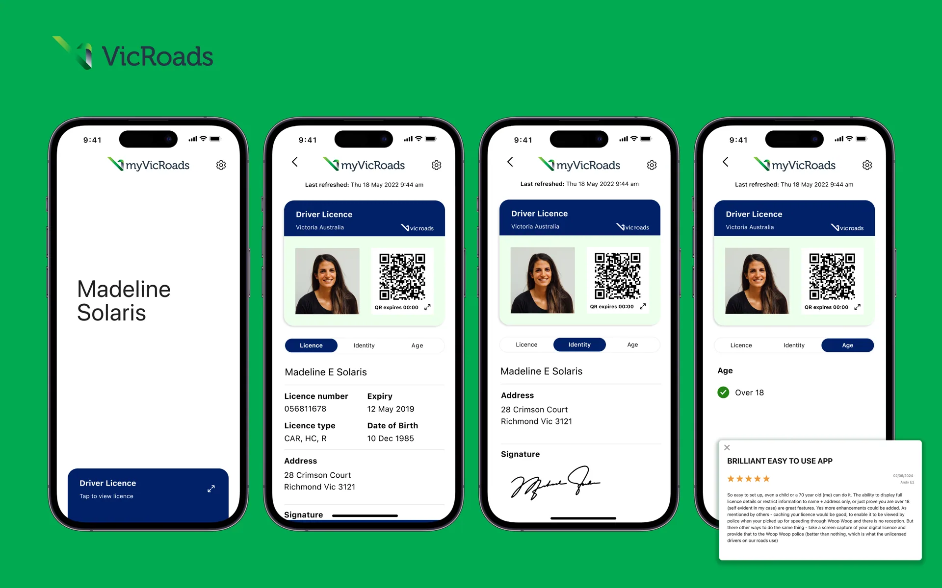 Image 1 of 2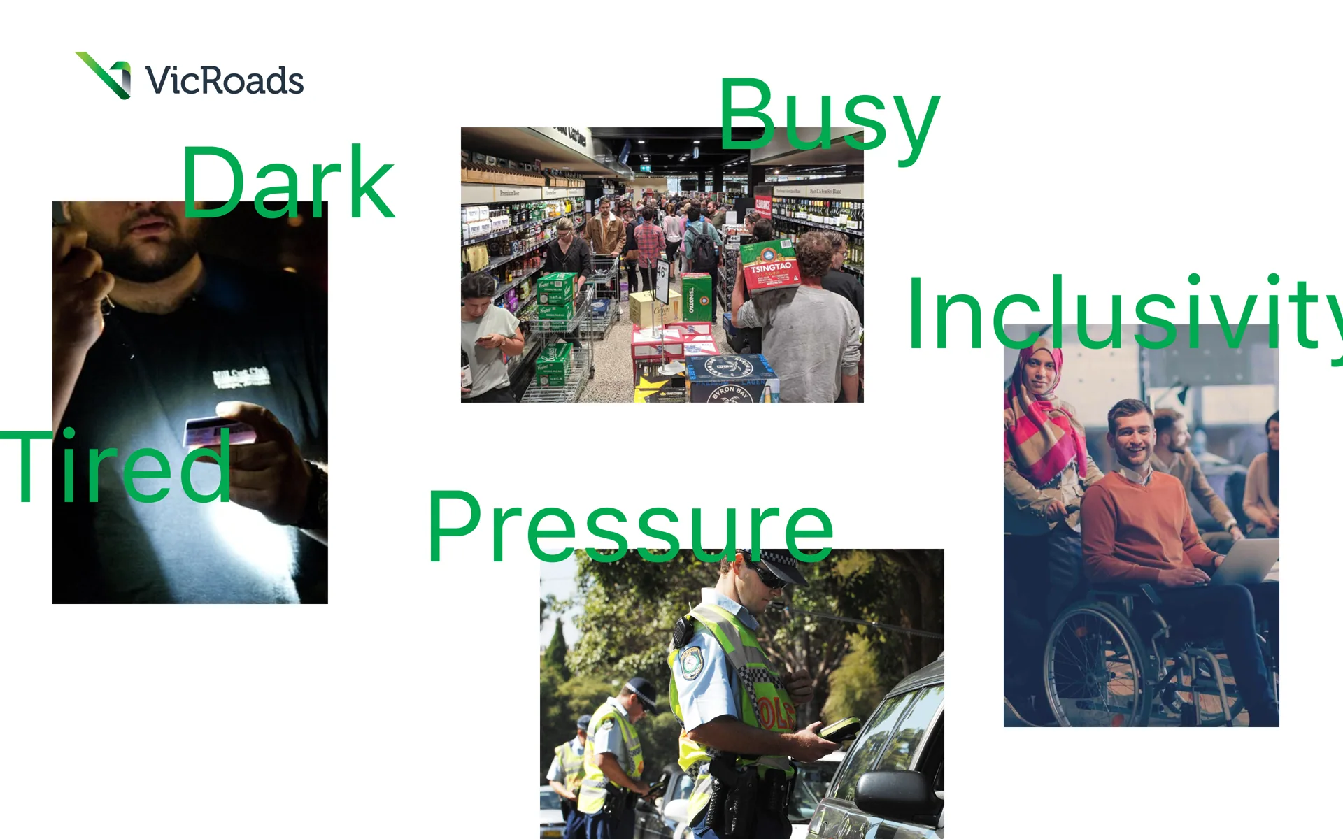
Snapshot
- Role
- Lead Designer
- Team
- Product, Engineering, Design, Policy
- Scope
- Native iOS/Android app, digital driver licence, phase 1 of a multi-phase platform
- Stakeholders
- Department of Transport, Service Victoria, Executive C-suite, Policy
- Constraint
- Two government channels competing to own the same product
- Output
- Shipped app, validated with Victorian Police and citizens, in pilot ahead of public launch
Overview
VicRoads needed a digital driver licence that could sit alongside the physical card for 7.2 million Victorians, and be trusted by third parties checking it, police, Australia Post, venues selling alcohol, often in the field, not at a desk. Phase 1 was proof of identity. Later phases were scoped to bring in licensing, registration and billing. The brief carried real weight: this was government-issued identity, used to verify age and legal right to drive, with privacy, security and accessibility treated as non-negotiable from the start rather than added later.
The dual-audience problem
Most identity products design for one side of the interaction. This one had two, with very different needs. Citizens needed an experience that felt as simple and reliable as pulling a card out of a wallet: fast setup, biometric and PIN security, and a licence that behaved like the physical one they already trusted. Validators needed the opposite kind of design attention: a scanning flow that worked under real field conditions, at night, in a busy venue, at the end of a long shift, under time pressure, and one that gave an unambiguous result (verified, expired, invalid) in a glance.
Designing for "busy, dark, tired, under pressure" as real usage conditions, not edge cases, shaped the validator flow as much as the citizen-facing one. A clear pass/fail state with minimal text, high-contrast colour coding, and no ambiguity in the failure states (expired vs invalid) mattered more here than visual polish.
Identity security: two codes, two jobs
A digital licence carries a fraud risk a physical one doesn't: a screenshot. Anyone can screenshot a static QR code and hand a phone to someone else, or reuse an old image, so the credential itself had to be designed to resist that.
The licence screen carries a QR code with a visible, time-bound expiry ("QR expires 00:00"), refreshing on a short cycle rather than staying static. That turns the QR code into a live credential rather than an image, a screenshot goes stale within minutes, closing off the most obvious fraud path. This is the code designed for general, everyday validation: Australia Post, venues checking age, anyone who needs a fast, low-friction check.
Sitting separately is a second scannable element, a barcode marked "for official use only," tied to the licence number rather than a rotating token. This is the code built for VicPol, where the validation need is different: officers need certainty of identity tied to an official record, not just a pass/fail glance, and need it to work reliably against police systems in the field rather than depend on the same expiring-token logic built for a bartender's quick check.
Splitting these wasn't duplication for its own sake, it was matching two genuinely different trust requirements: fast, low-stakes, expiry-protected verification for everyday use, and a more permanent, officially restricted identifier for law enforcement, without forcing one code to do both jobs and being weaker at each.
Native and multi-sensory design decisions
Because this was a native app handling legal identity, interaction design leaned on native device capability rather than pure screen design: camera for QR scanning, accelerometer and motion for card-like handling, vibration and sound as secondary confirmation alongside the visual verified/failed states. Progressive disclosure kept the citizen's home screen to what matters most, the licence itself, with detail (address, conditions, card number) a tap away rather than front-loaded.
Navigating a two-channel political constraint
The department and ministers wanted an aligned product across two digital channels, Service Victoria and VicRoads, which meant design decisions here weren't purely a UX problem, they had to hold up against policy and cross-agency alignment at the same time. That added real friction to what should have been straightforward interaction decisions, and it's the kind of constraint that doesn't show up in the screens themselves but shaped how many rounds of validation and stakeholder sign-off any given flow needed before it could ship.
Outcome
The product was validated directly with Victorian Police and citizens through multiple rounds of testing, then moved into a live pilot in Ballarat ahead of a wider public rollout. It shipped to the App Store and Google Play as myVicRoads.
Reflection
The hardest part of this project wasn't the interface, it was holding two very different user contexts (a citizen at home, a police officer scanning in the dark) to the same standard of clarity, while designing inside a government structure where the product itself was politically contested before it was a UX problem, and where the security model had to earn trust from both a teenager buying alcohol and a police officer checking identity in the field. Getting a shipped, validated app out of that environment is the part I'm most proud of.