
Till Payments: a partner portal for managing 110+ merchants
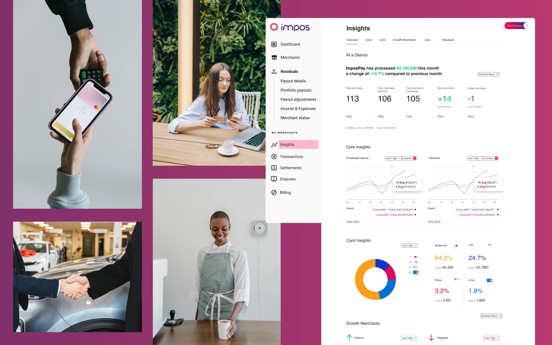 Image 1 of 4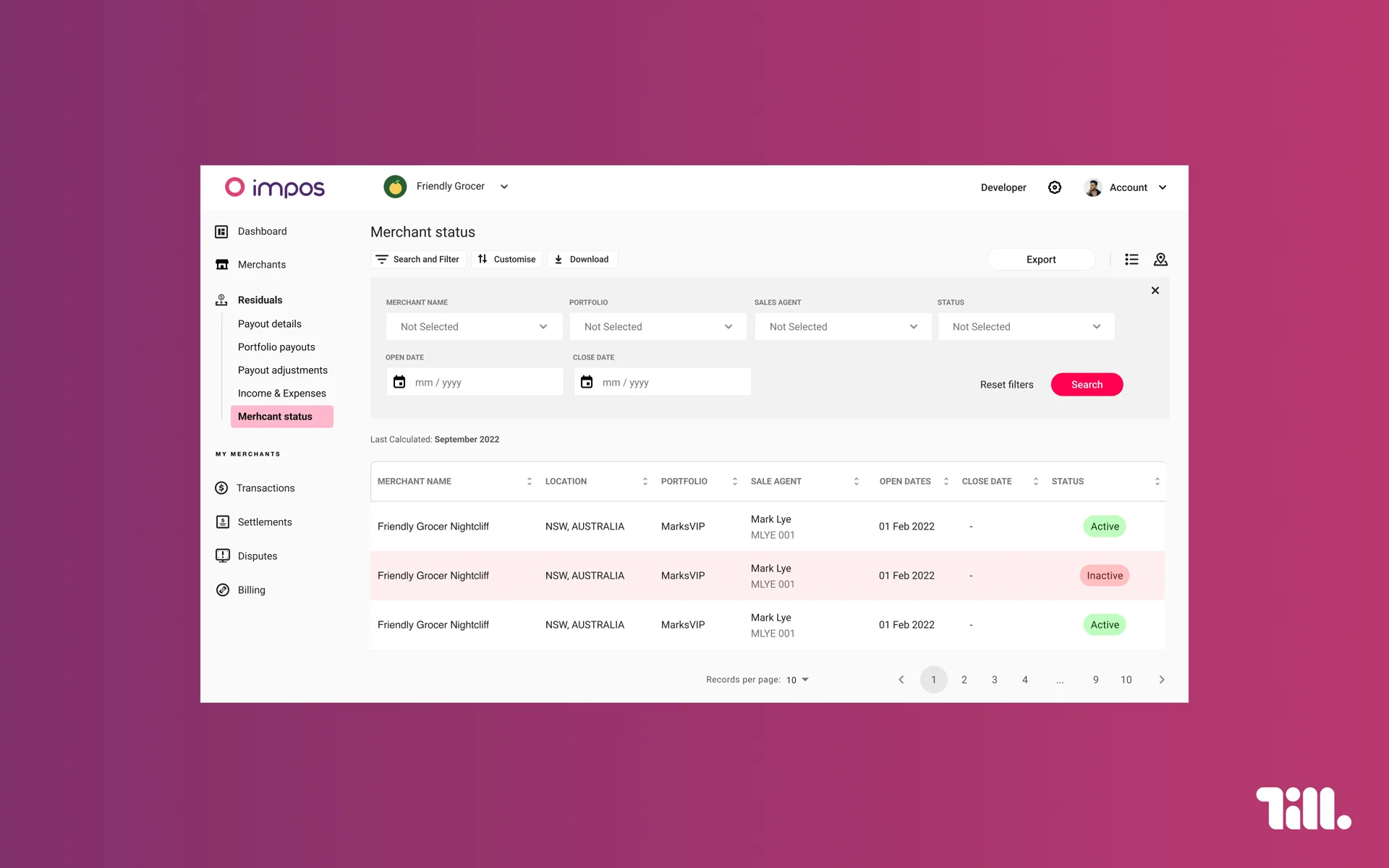
Snapshot
- Role
- Senior Systems Designer / Senior Designer
- Team
- Product, Engineering, Design
- Scope
- Multi-user partner portal, UI uplift, user management journeys
- Client
- Till Payments, payment acquirer
- Output
- Validated by Impos partners in user testing
The brief
Till Payments needed a portal that let partners manage multiple merchants (franchises) and their payment solutions from a single place, rather than the fragmented, manual process they were running before. Scope covered specific user management journeys alongside a broader UI uplift: white-label customisation, a transactional dashboard, interactive tables for merchant onboarding, terminal provisioning, multiple payment products, and technical support, all needing to work for partners managing not one business but a portfolio of them.
The real problem: data buried in email and spreadsheets
Before this portal, partners were managing well over 100 merchants each through email threads and Excel spreadsheets, tracking status, payouts, and product provisioning manually across dozens of individual relationships. That's not a UI problem so much as an information architecture problem: the data existed, but finding it, comparing it, and acting on it took real manual effort every time. The design brief was really about turning scattered records into something a partner could see and manage at a glance.
Design approach
The interactive merchant table became the anchor of the experience, giving partners a single filterable, sortable view across primary, secondary, portfolio and provisioning status, rather than hunting through separate documents per merchant. Insights and dashboard views surfaced the numbers partners actually needed to track (transactions processed, month-on-month change, revenue by merchant, growth trends) as visual summaries instead of static reports. White-label branding settings let partners configure their own logo, colour palette and business identity within the portal, important given these are franchise-style partner relationships operating under their own brand, not Till's.
Outcome
The product was validated directly by Impos partners in user testing, who described managing their merchant base by email and spreadsheet before this, and confirmed the new portal made that work easily manageable in comparison, a direct before/after read on the problem the design was meant to solve.
Reflection
This project was less about a single clever interaction and more about information design at scale: taking a partner's fragmented, manual workflow across 100+ merchants and giving them one coherent system to see and act on it in. The white-labelling requirement added a layer most portal projects don't have, designing a system flexible enough to feel native to each partner's own brand while staying structurally consistent underneath.